Results Resourcing is a freelance marketplace for small businesses, offering both a high-touch recruiter service and a self-serve hiring option. Already successful, the team aimed to increase revenue by reducing churn and drop-off.
The Problem: A confusing experience led to frequent support requests and drop-off before payment. Limited by time, budget, engineering capacity and significant tech debt, the team needed a focused, high-impact solution.
The Outcome: Targeted improvements to a single, high-impact flow delivered outsized results — the usability rating more than doubled, going from 1.6 out of five to 4.1.
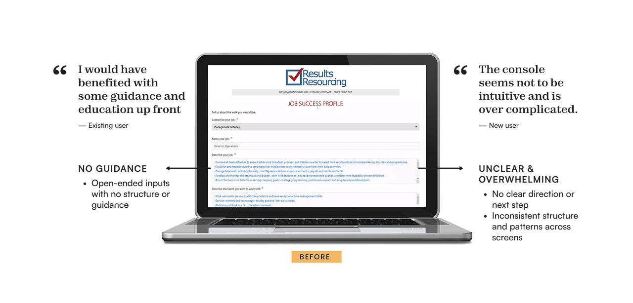
Users were expected to define their needs without guidance, leading to confusion and drop-off.
My Role
Product Designer
Position
Freelance
Bootstrapped Startup
B2B SaaS, 2-sided model
AWARDS & PRESS
Finding the sweet spot: the biggest reward with the lightest lift
Research
To understand where and why users were dropping off, I looked across product, business, and engineering:
Stakeholder interview with CEO: Learned about the growth stagnation and revenue concerns
Stakeholder interview with CTO: Identified specific drop-off and churn locations, as well as tech constraints
Users interviews: Identified critical pain points, including confusion and unmet expectations
Many of the UX/UI challenges were expected. However, the user interviews also uncovered an unexpected insight.
Users' were inexperienced at hiring freelancers. These customers were drawn to Results Resourcing specifically as it promised "white glove" service. They expected to be guided through the process.
However, that premium white glove service didn't start until payment had been made.
Lack of guidance and considerable usability issues led to friction, confusion, lack of confidence, and abandonment for new users. Existing users were churning as the matches were "50/50 at best."
A single flow was the sweet spot
To identify triangulated across:
User needs → reduce confusion and increase confidence
Business goals → increase completed projects (revenue trigger)
Engineering constraints → limited scope for large-scale changes
A clear pattern emerged: the "Create a Project" workflow was the sweet spot to revisit in the UX.
Small improvements to the project creation flow could unlock considerable impact. It had high drop-off, could be improved within technical and time constraints, and directly impacted revenue.
Design Highlights
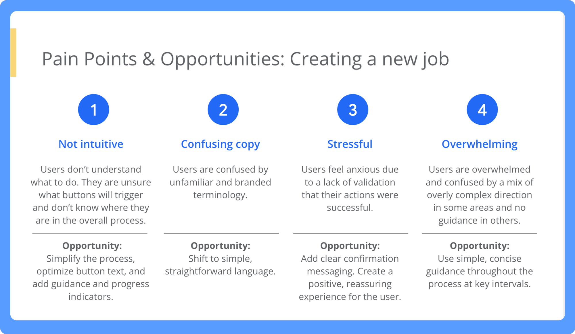
I focused on small changes that would reduce cognitive friction, guide decision-making at the right moment, and build user confidence through modernized UI, expanded guidance at every step, supportive microcopy and a clear structure.
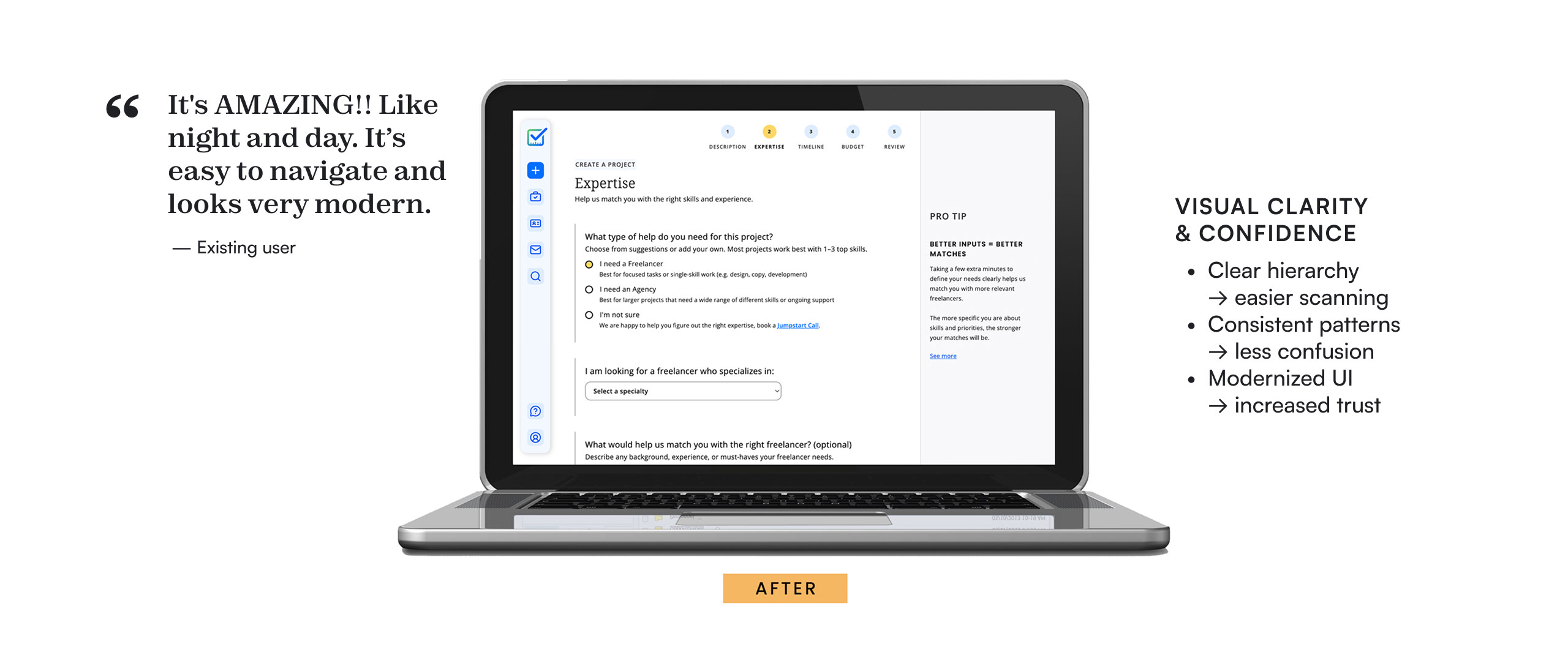
Simplified the experience: Replaced a long, ambiguous form with a step-by-step flow, helping users focus on one decision at a time and track overall progress.
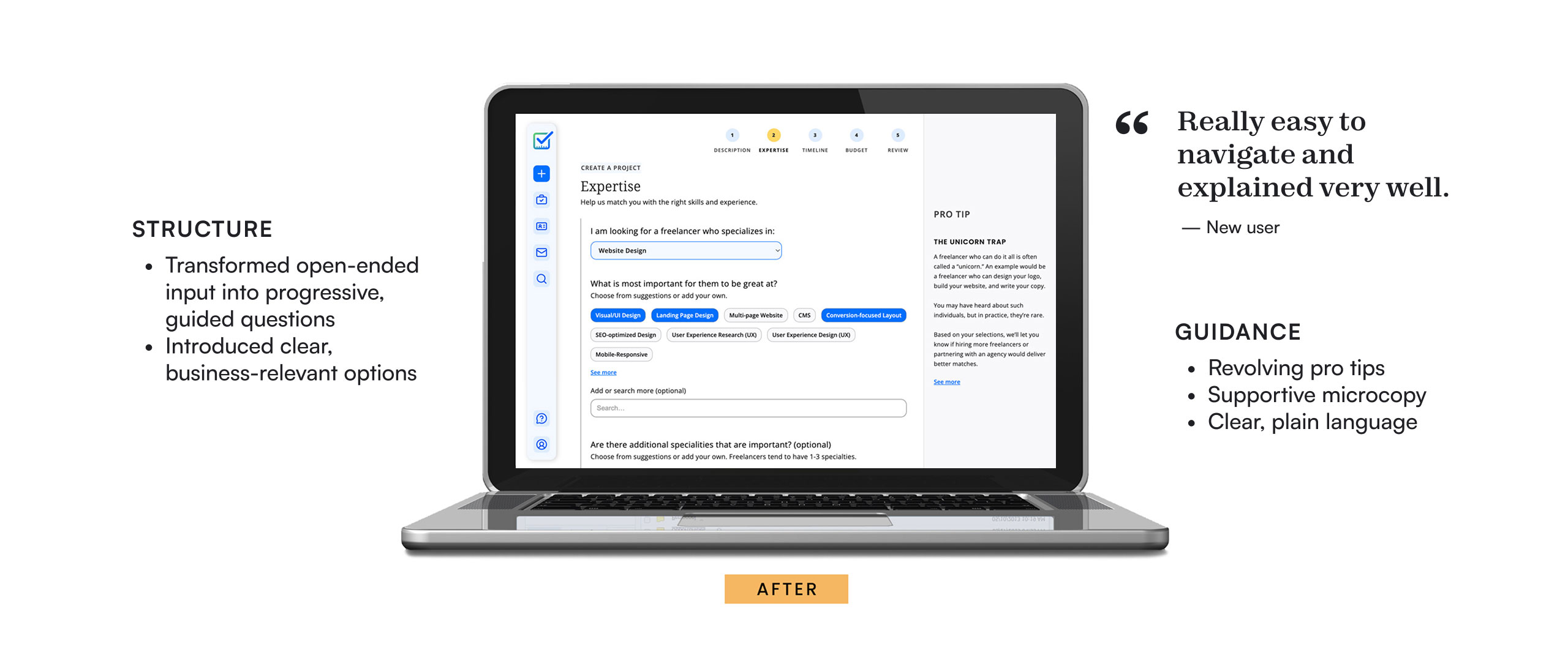
Structured user input: Transformed open-ended text fields into guided questions with suggested inputs, making it easier to define needs without hiring expertise.
Improved input quality: Introduced business-relevant options (e.g., skills, specialties) to help users provide clearer, more actionable requirements.
Guided better decisions: Added in-context support through microcopy and rotating pro tips to help users avoid common mistakes.
Increased clarity and trust: Improved visual hierarchy and consistency to reduce overwhelm and create a smooth experience that built confidence in the platform.
Shipped
A clickable Figma prototype of the project creation flow was tested with existing and new users. User feedback in testing shifted from an overall usability rating of 1.6 out of 5, to a rating of 4.1. Changes to the platform were implemented after my engagement, so I don't have real world metrics.
"It's easy to navigate and looks very modern."
— New User
A clearer, more consistent interface builds confidence and trust
A more structured, guided experience helps users define their needs and get better matches